Ops Insights #095 - How I Used AI for a Board Deck
August 8, 2026 | Read Time: 6 minutes | Written by Jenny Kleintop
The CEO asked me to present at the board meeting on our progress toward our $25M campaign goal. I’m doing fractional support, so I say “our” as I’m integrated into the team leading their philanthropy services. We have one other person in philanthropy services who focuses on gift processing and basic requests. The CEO looks to me to run the more complex requests, and the board meeting warranted more complex reporting.
Since I wanted stronger analysis and turnaround time was tight, I turned to AI for help. For this, I used ChatGPT, as it’s still my main go-to, but any similar AI tool, such as Claude, Copilot, or Gemini, can be used. The key is what you type in (aka prompting). I’m going to walk you through an example so you can see how to do it. As you use it more, you’ll start to get better at prompting; the stronger the prompting, the stronger the AI output is to you.
Keep in mind when using AI: Never put any sensitive, personal, or identifying information into AI. Keep it generic and de-identify before uploading. If you have a compliance or AI oversight team, check with them before using any AI tool.
Prompt 1/ First I typed in: We have a board meeting coming up and we are trying to make the case that we want to move from event-driven fundraising to individual-driven fundraising, meaning we want to increase our efforts to close more gifts outside of events. Can you look at these 3 graphs and help me tell this story for a board's perspective and understanding. 1) First chart = all giving 2) Second chart = giving through events 3) Third chart = giving outside of events
>> The response: Yes. These three charts actually tell a strong board-level story, but I would frame it as reducing dependence on events, not moving away from events. The data shows events are performing well. The opportunity is to build a stronger year-round individual giving engine alongside them.
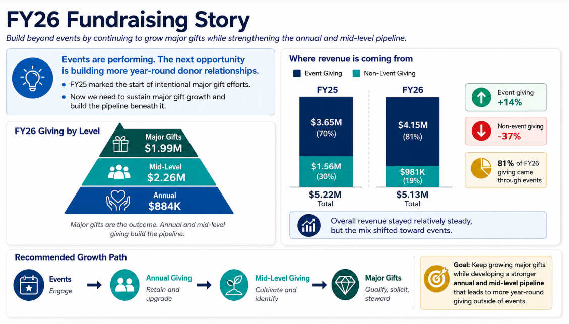
Prompt 2/ It gave me way too much explanation and too much to weed through so my next prompt: We just started major gift efforts in FY2025, is there a way to paint a better picture saying we need to keep that growing while incorporating more efforts at the annual and mid-level?
>> the response: Yes. With that context, I would change the board story quite a bit. The stronger story is: We have begun building a major gifts program. Now we need to sustain that momentum while strengthening the annual and mid-level pipeline that will feed future major gifts.
Prompt 3/ Again, good intel but way too many details. My next prompt: Should I show all 3 graphs to tell this story or just the first one?
>> the response: I would not show all three full graphs to the board. They are too detailed, and the board may get pulled into the rows and numbers instead of the strategic message. I would use the first graph as the main supporting data, then add one simplified visual comparing Event vs. Non-Event giving. That gives you the data to substantiate the argument without asking board members to interpret three dense reports. It also keeps the presentation focused on where you want to go, rather than spending most of the discussion explaining where the gifts came from.
Prompt 4/ Can you give me this graphic?
>> the response:
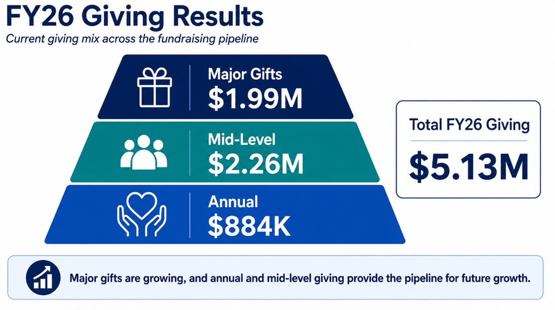
Prompt 5/ Can I get a graphic for this part: Slide 1. FY26 Giving Results
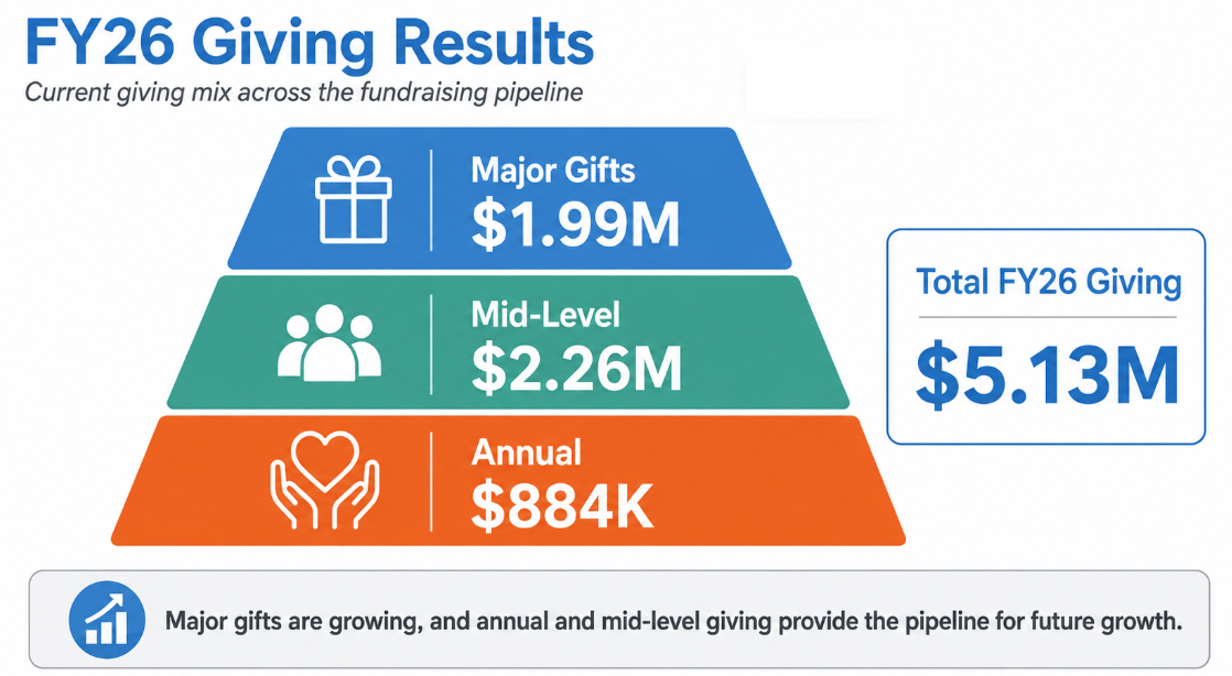
Major: $1.99M
Mid-Level: $2.26M
Annual: $884K
Total: $5.13M
>> the response:
Prompt 6/ Can you update and use these colors: Blue - R:67 G147 B209 Green - R:64 G:164 B151 Orange - R:243 G108 B40 Gray - R:207 G209 B208
>> the response:
Prompt 7/ Same format, style, colors, but now for: FY25-26 Giving Results
Can you sum up Major, Mid-Level, Annual for the 2 years and show the percent of dollars that come from those levels compared to the overall giving total
>> the response:
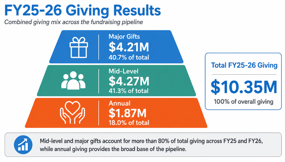
Prompt 7/ Can I get a graphic for this using the color palette from the last graphic
Building Our Year-Round Fundraising Pipeline
MAJOR GIFTS
Qualify • Cultivate • Solicit • Steward
↑
MID-LEVEL
Identify • Personalize • Cultivate
↑
ANNUAL
Acquire • Retain • Upgrade
And have EVENTS feeding donors into all three levels.
Major gifts are the outcome. Annual and mid-level giving build the pipeline. Events create engagement opportunities across all three.
>> the response:
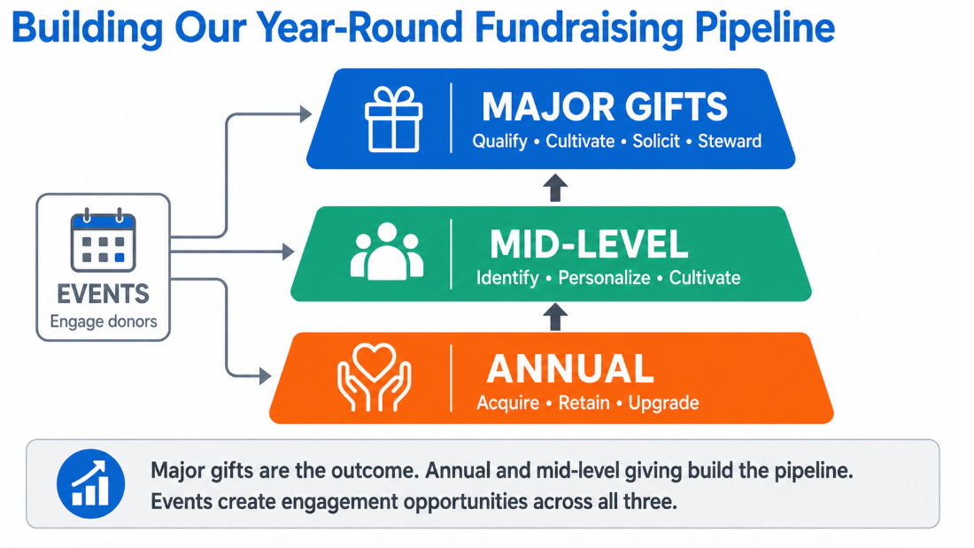
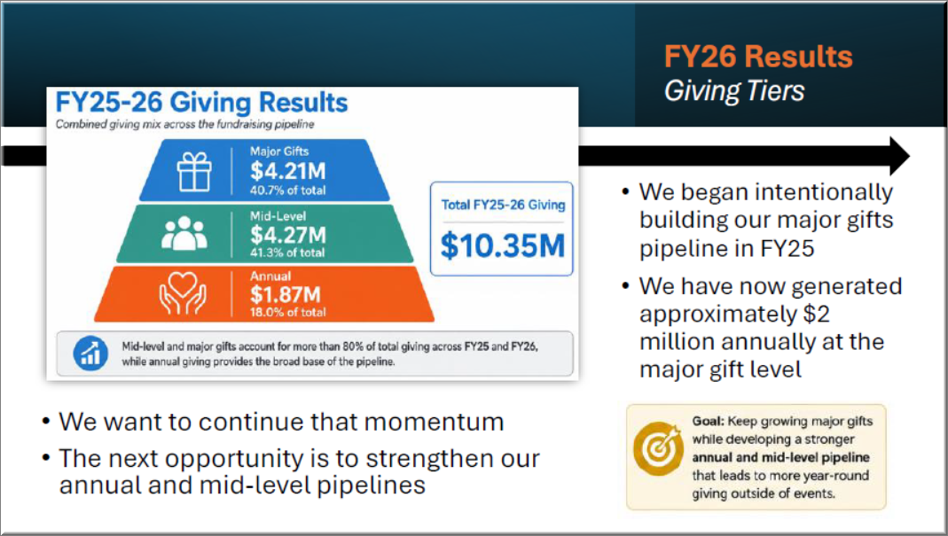
That got me a valuable graphic to drop into the board deck. Here’s the final slide:
Prompt 8/: Can you use the same style and colors and give me a graphic for:
1.We are still event focused and expanding into individual giving.
2.We are continuing to build our new pipeline/revenue stream for major gifts through our Major Gifts program.
3.We are continuing to focus on the unrestricted pipeline.
4.We are cultivating our pipeline to garner more revenue to reach our 16M - 25M goal with a focus on intimate salons.
5.We are looking to build out stronger annual and mid-level giving programs to strengthen two pipelines and increase revenue.
6.We still need to fill the gaps in our pipeline.
>> the response:
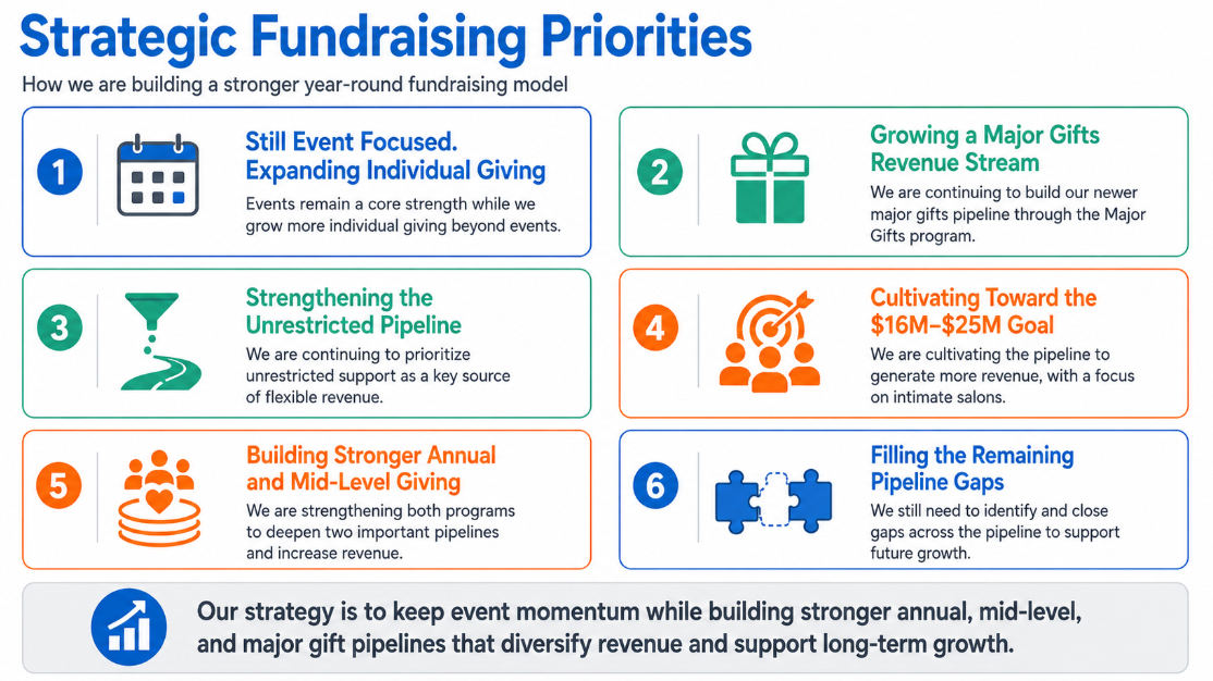
This I dropped into the board deck as the summary slide. It was more visually than a bullet list.
Lastly, the CEO asked me to point out a stat to the board.
Prompt 9/ Same colors and format, futurist style, take the attached to make turn it into a graphic with this phrase: In FY26 we had less gifts and raised almost the same as FY25 due to major gifts
I didn’t like the colors it gave me so I typed:
Prompt 10/ Not liking the look of that. the last image format and colors and give me another version
>> the response I added to my slide as a pop-up so I remembered to make the point:
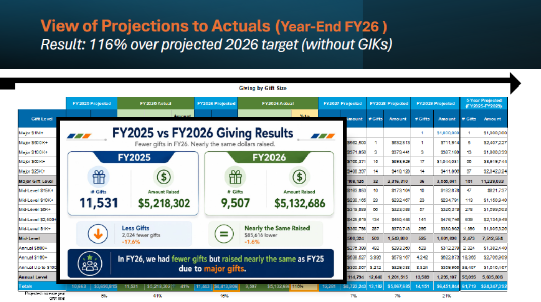
Each prompt took, on average, 1 minute to respond. In 10 minutes, I had 3 more insightful graphics to share with the board. The key is to know your audience; for example, with a board, you want to point out more highlights, the conclusions, and the overall stats rather than going too deep into the weeds with the amount of data you have.
Take Action
To see get more valuable insights to share with your board at your next meeting, follow these 3 steps:
1 ➡ Pick 2-3 slides where you feel it’s too data-intensive or not impactful enough.
2 ➡ Drop it into AI and start typing why you feel it’s not impactful enough and what you are hoping it could show, or ask it for help summarizing 2-3 points. If you need help here, ask your leader what they think when they see the slide. That typically will give you 1-2 sentences to drop into AI.
3 ➡ Use the updates in your slides and see how your board responds.
👋 See you next time,
Jenny
Whenever you're ready, there are two other ways to get help:
Insights: Receive these Insights directly in your inbox to learn, grow, and accelerate your expertise of philanthropy data, database, and operations. Plus, bonus insights are often in the email version. Add your email here.
Hands-On Support: Get personalized assistance when you need it the most through fractional support. View here.